Sunday, 1 March 2015

Font Styles/Typeface

TYPEFACE- is a set of one or more fonts each composed of glyphs that share common design features (for example; weight, style, width, slant, italicization, etc.) 

FONT- is a set of printable or displayable text characters in a specific style and size. 

I don't really like this as it gives off a creepy effect. It is more suitable for
the horror genre as the letters almost seem scratched onto the screen. This is
not the type of font that would normally appear in a opening title sequence to a high
school drama.
Again, this font does not seem to fit into our title sequence as it seems more of a font
 that would appear in a film about magic or the future. The design on the letters make it
seem more high tech. However, I do like it as it is appealing to the eye and different to
other fonts.
 

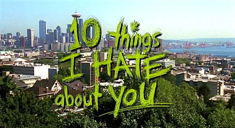
This is my favourite typeface out of all the ones shown above. It is simple yet is
designed to be different so that it stands out. I hope to use this font in our title
sequence as I think it gives off this sketchy look which high school dramas have
in their title sequences. I think in a different colour would look even better. 

Christmas Homework (post 23)

Facebook Page (Audience Profile)

Here, we created a facebook page of someone we believe could fit into our target audience. She is a teenage girl with a keen interest in anything girly (twilight, taylor swift, fashion, etc.) We tried to make her fit into the stereotype of someone who could see a teen drama. We have also shown her likes. 


Blog Healthcheck 3- 27th March

Things that I need to improve on: 

-Personalise the blog. Since starting it, we haven't really personalised it so people know its our own. We need to give the blog some personality so it is not basic and can attract people's attention. Sticking to something simple yet elegant really could work for our blog. 

-Post the draft storyboard that we intended to use for our title sequence. Then update with the one we actually used. 

-Post the pitch presentation we did, and with feedback. 

-At the moment, there is not enough evidence of planning and production on the blog. (The posts lack the right amount of detail to achieve a good grade). 

-Post more filming and editing shots. 

THE PITCH

Saturday, 28 February 2015

Fonts/Typeface


We have decided to use as many software such as imotion and final cut pro. Above are some examples we have looked at for our title sequence however due to our title sequence being aimed and related to teenagers we decided to have something more fun and not so serious. This is why we thought that the font and typeface for 10 things I hate about you was good, because the sketchy handwritting adds to the high school effect. However we may also want to keep our font simple but have the font move around more.


23. Who will produce our film?


We want our film to be produced by Paramount Pictures, because we believe that they are a successful company and our film is a big budget high school drama, therefore we thought that if Paramount Pictures was to produce our film this would make it more successful. Paramount Pictures have distributed and produced many films such as Mean Girls and Save The Last Dance and since both these films were very successful in the film industry and were both high school drama's we thought that it would fit in with our film too. However if our film was to be a independent film we would of gone with more cheaper companies and with a variety of different companies to distribute our film. For our film we would like Warner Bro's to distribute our film and this is because they have produced/distributed films such as all the Harry Potter series and Project X which is also aimed at teenagers just like our film.