Sunday, 8 March 2015

Changes made to plot

Changes made to plot


During the course of filming we encountered various issues, we didn't have enough footage of Valerie who was initially the main characters secret crush and conventionally, the amount of airtime the character gets connotes the importance. 

However, Dilara had more footage, which meant it would be easy to edit a lot more time in for Dilaras character. So after getting permission from the director we decided to use more of Dilaras shots and changed her to become the main character. 

Other characters have remained the same as before. 

Camera Angles and edits in motion and Final Cut Pro


style of font that we used.


43. Reflection- CHANGES

CHANGES
- One of the changes we made was the changing who the main characters were. At first Valeria was meant to play the lead role along with Bilal. However, when we started editing we realised that Dilara had more shots. Instead of filming again, we just used Dilara as a main character. This allowed us to establish the main characters by letting them have more air time. This means the audience will find it easier to realise who the movie will be about. 
- Another thing we changed was the location of the school shots. At our first location (after importing on the computer) we realised the shots were out of focus. When we changed the location, we realised this was for the better as we found this fit our movie type more. There was also better lighting at the second location. 
- We also changed what type of shots we were using. We didn't quite stick to the storyboard as when trying to film the planned shots, we found they were trickier to get right. Therefore when filming, we changed some bits around and then followed through with the rest of the characters to show continuity. 
- During editing, we also changed the placements of some shots. This allowed us to get more match cuts in, which then improved the quality of our overall product as the slightest of changes made it seem seamless. 

Bilal's Character


43. Reflection- COSTUMES

COSTUMES
We had less issues with costumes, but still had some hardship. 
- Our biggest problem with costume was Bilal shaving his beard half way through filming. This created a problem as we had his morning shots ready but still had to do the school shots. We realised we had to re film his shots. 
- We tried to represent our characters personality in the way they dressed. For example, we had the 'geeks' wearing superhero jumpers and one wearing glasses. While the 'populars' wore leather jackets matched with black clothing. 
- Everything the characters used, we tried our best to link the character with their costume. 

Blog Changes- response to feedback from Teacher

The blog was boring and en engaging, there was no use of colour and it had no identity, so we changed the colour and the layout of the blog. 
It made it more engaging and I started to use videos to showcase work, more usage of technology. 
And also broke up the amount of writing, images and other 


43. Reflection- LOCATION

LOCATION
During filming we faced a lot of problems with our location. 
- One of our problems were to do with the lighting where we originally wanted to film Dilara and Bilal. When we looked back at clip on the camera, we thought it looked fine. However, when we imported the clips on the Mac, it was very dark. You could barely see what was going on in the shot. To fix this, we had to film all the shots again. 
- At first we also had trouble finding a school that was willing to let us use their corridors in our scenes. We needed special permission to film at some schools and we really didn't want to film at college. When we did film at our first school location, we found the footage to be out of focus. This was a problem we didn't notice until we had already put the clips on the Macs. However, luckily, we found another school within the last couple of days. This location was much better than our first one. An upside was it was still light, which meant there was natural lighting on our shot (making it look much better). 
- We also realised during shooting that we choose too many locations. This made filming much more difficult as none of the locations were close to each other which meant we had separate days for filming each setting. This was very time consuming. If we had to do it again, we would limit the amount of locations we had. 

Type Face and Font influence.


Texts that influenced our plot and story line.


Part 1

Part 2


28. Media Texts That Influenced Us

From looking at different high school drama opening title sequences, we personally liked 10 things I hate about you as we have seen it before. In the title sequence, we saw how the text here was made specially for the movie and we haven't seen it anywhere else. We liked this because it was creative and personal. The colour green, seen here seems to create a contrast against the blue sky. This shows how the editors seemed to consider all elements when creating the media text. The text also looks sketchy, which makes it look handwritten in a way, again making it look even more personal. 


Another high school drama text we looked at was Mean Girls. Again, this was another personal favourite of ours, The font seemed to reflect the movie and what it is about. In particular, the word 'mean' is put in bold to put emphasis on what the movie is about. The colour pink, also reflects the movie as it is mostly female dominated (hence the name). Everything that was used in this media text reflects back to the film. For the text to connect to the audience, it needs to have relation with what the film is about. 

what is genre and what is teen drama?


Genre: 

a style or category of art, music, or literature. It is the type of product and what category it fits into.


Teen drama: 

Teen drama is a genre of film, the concept of a teen drama is to be seen to be conflicted with youth and also the idea of "coming of age"

most teen dramas tend to create the same story lines, characters, locations, and poular gang or youth culture. 

these tend to differ from the types of institutions that invest in producing the film.

What institution are involved in making a Teen Drama film?


Costume

The costumes that was too be used in the film was incredibly important for various reasons such as:

establishing who the characters are.

this was especially important, we wanted the audience to quickly understand who the characters were and what social group within school that they belonged too.

they had to reflect the true identity of who the characters were.

the "nerdy" characters had to be wearing similar outfits so they were set apart from the other "popular" characters who were wearing black leather and white.

although it was important to pair up the "romance" by using black in Dilaras outfit to have some slight correlation with Bilals character.


12. Analysis of the Order of Title Sequences - Similarities and Differences

Specific reasons for relocation.

Filming had to be relocated various times due to different reasons.


Policies on under age shots of students had changed so we then relocated to Martynas school, used very little natural lighting which resulted in low amounts of light in the film, finally relocated to Dilaras school, more glass in the structure of the school therefore more natural lighting.

What are the subgenres of teen film?

What are the subgenres of teen film?

Youth Drama.

-       Some subgenres focus on social dilemmas faced by the main character, usually male.
-       Seen to be a more authentic representation od youth and therefor more relatable.
-       The main character is often rebellious and/or conflicted with others
-       Mainly focused on the difficulties faces during the teenage year and is seen as being difficult problem


High School drama.

-       Started become popular in the 1970s
-       Various amount of subgenres surrounding high school drama
-       Shows the similarities and differences of the socialisation of groups in school and home
-       Often enjoy the idea of being youthful
-       Lead character is often a girl but might focus on other males

-       Tends to focus on the main character and the other groups that are conflicting within school.

Reflection (Costume and Location)


Our costumes were very successful we didn't have to change any of the main outfits when we got a chance to reshot some people decided to change their pyjamas but overall our outfits were very successful we didn't have a problem with people not being able to bring their clothes in or not being able to find it which was good because we wanted our title sequence to look as seamless as possible and having different outfits wouldn't make sense or add up so we're really happy with our outfits outcome. However for our location we weren't as lucky this is because we had problems such as two peoples houses were being done and couldn't be used for filming till later on and when we filmed at Martyna's school we realized that the shots were dark and blurry therefore we had to re take  it and instead of retaking it in Martyna's School we decided to use Dilara's School, this is because it's much more lighter and we had a range of places we could use as the school was much bigger.

15) Individual Post - The Breakfast Club

Our Website

Our official website for our film:
http://ohmygoditsdee.wix.com/tbhurnotallthat

40. Revision to pitch feedback

Most of our feedback was positive. The audience who viewed our pitch said several things. Here is what they said.  

POSITIVE
- The detailed production plan. Allowed them to see the dates of each stage of production. From this, we can see that we need to stick to the plan as it is important we have enough time to follow through with all the steps. 
- The layout of our pitch. We were told that our pitch was laid out really well and that we showed each step really clearly. It was a clear concept and people got our idea.
- We were also able to explain the different skills we felt confident in. They showed the viewers that we will be able to complete our product successfully. 

NEGATIVE
- Lack of storyboard. As we are behind the idea of our title sequence, we know in our heads how it will look like but other people don't. This is why we need to create a storyboard to show other people our ideas. Creating a storyboard will also help us with the shots we need for each character and not just make it up on the spot. 
- More detail about the audience. We didn't have much information about what type of audience would be drawn to our film. We think that, while filming we need to think how we want to connect with audience via the representation of the characters. 
- Not appealing to over 30s. As this film is a high school drama, we are not really worried about connecting with the over 30s. However, we see how even the title (TBH UR not all that) can not relate to the auidence. But, we feel like if in the film we somehow try to explain it (for example, one of the characters say what TBH stands for very slyly). 


Blogging Health Check 3

After reviewing my progress on what my teachers have said on my work I got a lot of positive feedback but most concerns were:


- keep up to date with and complete all tasks on the blogging checklist and continue to develops use of ICT apps to present your work
- attend workshops to keep up to date with blogging
- attend workshops in general

These were most of the same aims that I had said back to me after the first health check. I realise that even though I am blogging, I do not blog on a daily basis, which I am supposed to be doing.
This is something that will definitely put me behind and most probably will make me lose marks I'm coursework.

This is something I have now become serious about and want to make sure that I get a good feedback  when it comes to reviewing my progress once again. 

Costume Pack

The costume for the main geek:
 
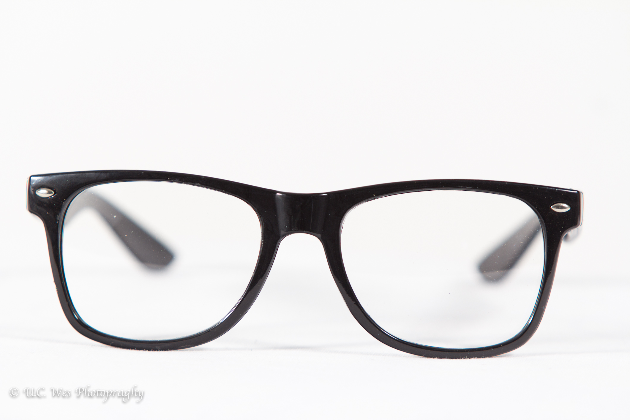
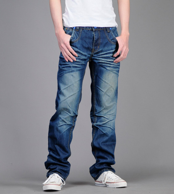
We have used a batman top and simple jeans because we wanted our film to have stereotypes this would mean having geeks in marvel clothes and glasses, so we decided to dress one of them in a batman tshirt and glasses.

Costume for the main popular guy:


We wanted our popular guy to look rich with his clothes which is why we decided to have him wear expensive clothes and a chain.
Costume for geek number 2:


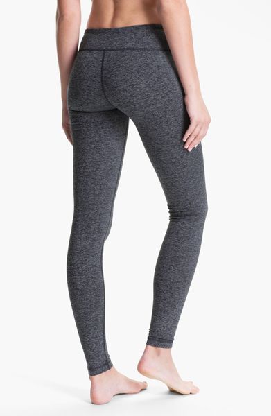
Like the previous geek we wanted to be stereotypical so we made the other geek dress in a superman tshirt and simple black leggings.
Costume for popular girl:
 

The popular girl wasnt going to stand out as much as the boy but still look good in her clothes which is why we decided that she should wear clothes that stands out and how she acts brings out the character more.

28) Media text influences


Also, When looking at all her movies that have different ways to present their title sequences, two that especially had me interested was ' 10 Things I hate about you' this is because I felt like it fit perfectly with the idea we had for our video, it was roughly the same concept.


Another one that we thought we could also relate to was 'Mean Girls'. Specifically the title sequence, where we are instantly presented with the characters, this was one idea that we wanted to include, having the audience presented with the main characters straight away.


Also, the way the title has been created, you are instantly attracted to the word 'mean' because of how big and bold it is, this was another idea we were influenced by.

Location Pack


We had a variety of locations, one of the locations was Valerie's bedroom we also used Martyna's house outside and Dilara's bedroom.
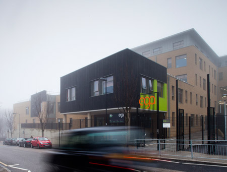
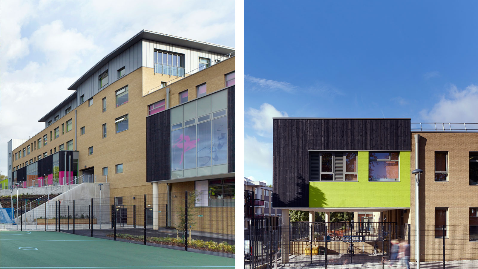
We also used Dilara's old secondary school, Elizabeth Garrett Anderson. Different characters had different rooms to make it look different, we changed some of the things around or added things or made sure certain people had certain things, for example Bilal's and Martyna's characters are considered to be rich therefore they had a double bed to show part of this. However the nerds/geeks had either a single bed or slept on the couch.


Editing

After other members of group 9 had also edited, I also gave my part, I added some match cuts into the movie and also created the ident for the production company names. 
In order to make the title sequence shorter, I also helped to cut some clips down in order to give space for anything else that might have been needed.

24) Fonts/Typeface


When working with motion, I got the opportunity to chose any font I thought would go with the film.

The original idea, was to have the names of the characters in bold, the names and titles of the people who helped make the movie in a different more smaller font and the title of thr film in a big bold font that would stand out 

For the characters names, my idea for the font would be:

My idea for the job title and name of workers would be:


And last but not least, the font for my title:


Editing


This is evidence of us editing we used the mac with three screens which helped us a lot and we got a rough cut done and this helped us realize the order of the shots and where we wanted the characters.

18) Motion

After having a brief introduction on how to use motion, I got a chance to create some title credits for my self.
I thought that it would be quite simple but after having a go, I found it to be actually quite difficult but I then figured it out and created something.
When you have opened Motion, you select the 'new project' option and you have a blank screen where you can begin. 


After this, you can see on the side, a selection of things, in this case I selected the 'library' option which already had some designs on there, which I could use.

After that, I dragged the design I wanted, onto the blank screen.

The option of 'at' at the top left of the screen means that you can create a text box anywhere you want, to put in anything you wish for your title sequence to say.

Filming (Dilara's Scenes)


We had to re shoot Dilara's bedroom scenes as well and decided to do it in her house instead and we did it much better this time as we were more prepared and the lighting was more convenient in Dilara's house which meant we didn't need to use a top light.

Filming


We had to reshoot our school scene and we ended up having to change our location to Elizabeth Garett Anderson. This was one of our best scenes that we took, it was quick and much easier as we knew that this time we had to check if the ND filter was on and if it was focused or not.


Blogging Feedback 3

You have become less engaged in the blog since the production began and as result your blog is becoming less strong, meaning that you are dropping marks. In order to address your decreasing mark, please complete the following tasks as a matter of urgency:

- post up which 3 films or title sequences have influenced your work and ideas

- post up your rough cut

- post up your feedback to your rough cut from your teacher (either as a list or preferably a video or sound recording)

- get and post up feedback to your rough cut from your target audience

- post up evidence of your group editing - there is nothing at the minute

- post up some reflection of your rough cut, how your title sequence is developing and how the skills you are learning during filming and editing

- post up more evidence filming


Poster


I created this poster on Photoshop, I used two of the characters and put them onto a blue background and then added our title 'TBH UR NOT ALL THAT' which is short for To be honest you're not all that, I then added a pair of glasses which is a stereotype for geeks and made it seem as it is hanging down the title.

Blog Design


We decided to change the colour of the blog to blue because the poster from our pitch was blue as well, although that blue was too hard and bright I decided to use a softer blue to go with our blog and We think that the layout of it goes very well as it looks like a website or a social media site. It was also in our blogging healthchecks to personalise our blog.

Genre and Teen Drama Film


A genre is a style of category of an art in this case of  a title sequence / film.
A Teen Drama film is a film that involves teenagers and is usually aimed at teenagers, it splits into two categories: High School Drama: this is a high budget film and is most scenes are based in a high school. Youth Drama: this is usually an independent film and is based on the streets.
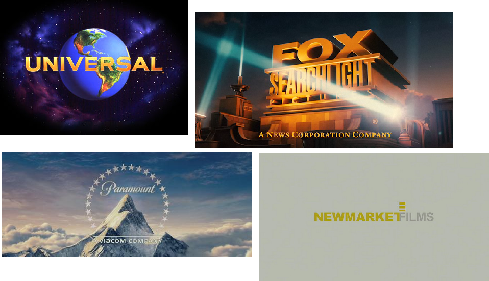
Institutions like Paramount and Universal will do high budget films like mean girls and clueless.
Institutions like BFI and TMC films produce films like Kidulthood.

Art of the Title - The Cabin In The Woods.(Title sequence Influence)


The Cabin In The Woods

-       Lionsgate.
-       The production team
-       Who wrote the film – writers
-       Behind the titles we see old images of violence
-       Title of the film is shown next in the largest font in red, which represents blood, audience is aware that the movie is going to be about some sort of violence and killing.
-       See the cast names of the movie.
-       Font is not bold but is red, which stands out on top of images and also connotes the colour of blood, which is significant as the movie is about killing and violence.
-       Little red drops also appear to show blood splatters.
-       Cast names and other information is toward the bottom right hand corner it is visible but not blocking the images
-       The title of the film is large bold red which covers the background picture, to finally establish the movie beginning which is important to the audience so they are aware of when the action begins.
-       Music track is a slow and doesn’t grab the attention or change the atmosphere of the movie, which does create a sense of foreboding because the audience is kept on  “the edge of their seat” to ensure they continue to watch until something bad happens

influence. 


-       I chose this sequence because the way the titles are displayed is very different to the previous one I analysed, The Walking Dead.
-       Also the way that the titles are placed on to back images, not to disturb the action but to be informative of who has taken part on the making the film and is an aspect that is gong to be used in the final product. 

Art of the Title film analysis. - The Walking Dead (Title sequence Influence)

The walking dead

-       Actors names (Cast) in order of how significant the character is. 
-       Executive producers of the show are and who the show is developed
-       A novel what the show is based on
-       Title of the show in the boldest font.
-       Fonts are a yellow/white colour almost the colour of rotten flesh which relates to the type of show and what it is about
-       Title of the show is the boldest font of all the text that is shown, important use of large text to capture audiences attention and start the show of at a bit of a climax.
-       Behind the font we wee significant or relevant images of props characters use in the novel such as Daryl's crossbow arrows.
-       See locations which show locations that will be shown in the show at a particular time for the current session season such as Woodbury or the prison, which ensures that the audience are brought up to date with the current story line so they don’t feel like they have missed out on any of the show.
-       High-pitched tone of music, which creates a sense of excitement for an audience and engages them.
-       The title images or names change each season too add new actors and therefore an change in characters, also producers who have joined  the production and added to fund or changed to management of the cast.


-       I chose this sequence because I was someone watching it for the first time the title sequence uses good fonts, colours and images along with engaging music to interest me into viewing the show which interested me
And it is something that i want to recreate in out title sequence, easy and succinct attention grabbing from the audience and full attention through out the rest of the movie.